Book cover re-designs: A pro offers 7 before and after examples
Is your book cover due for a makeover? These 7 book cover re-designs from a pro show the difference a re-design can make for your book.

I know cover designer extraordinaire Alexander von Ness through his Self-Publishing and Book Marketing Group on Facebook, where I’m a group administrator. Alexander is a book cover designer with more than 20 years of professional experience in graphic design, including more than a decade as art director in a branding agency. In the past 10 years, his main area of focus has been book cover design. His website, Nessgraphica, is among the top trusted sites for book cover design services overall.
Book cover re-designs: A pro offers 7 before and after examples
By Alexander von Ness
Are you wondering if you should you re-design your book cover?
You’ve probably noticed that more and more authors are doing this.
They’re doing it for several reasons, but the most common and important are:
- The author isn’t satisfied with their current cover.
- The book sells poorly because the cover doesn’t fit the genre.
As a professional book cover designer, I can show you what it looks like in reality and reveal a few cover design “secrets.” They might help you decide whether and why you might want to think about doing this for your book, too.
Lessons from book cover do-overs
No one wrote and published a book just so it would sit on a shelf, no matter what they say.
Eventually, most want to sell as many copies as possible so their book becomes popular. A good cover will help get you there.
To illustrate the value of a good cover design, I’ll share a few examples of what a book cover re-design looks like and why I made specific changes.
Book cover re-design 1 – Hearts Set Free
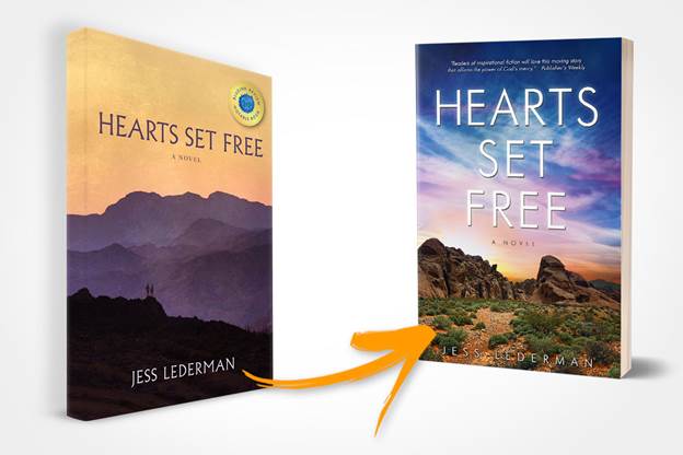
In this example, we can see that the re-design does not deviate in general from the original. The focus on the sky (which the author strongly insisted on) turns this cover into a real “beauty” that will surely give this book much needed gravitas and character.
The author wanted the cover to contain only two basic elements, as explicit opposites. They are the desert, as a synonym for loss and helplessness, and the sky, representing hope and a new beginning.
He also wanted to strongly emphasize the contrast between these two elements while showing how they fit together, too.
I’m very pleased with this re-design. I think that it’s a great example of how with very few – but high quality – changes, a book cover can look fantastic and professional without deviating from its original.
A more detailed overview of this book cover re-design example can be found here
Book cover re-design 2 – The Career Game Plan
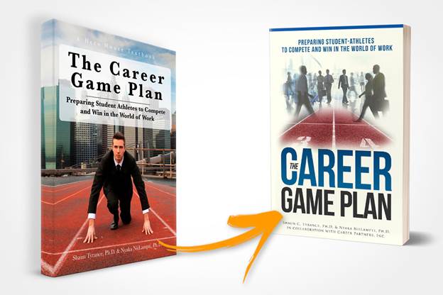
In this example, we can see that the re-design has a noticeable shift from the original cover, with the new cover still making a significant difference.
Where? In the title placement, for one.
Changing the title font and repositioning it in a much more visible location makes a huge difference. Additionally, I cleaned up all the clutter around the title and subtitle by stripping it so it’s as visible, readable, and transparent as possible.
I also replaced the photo of a man in a suit with an image of both men and women. This moves the design away from an exclusively male audience to include women, which is very important for this type of book.
A more detailed overview of this book cover re-design example can be found here.
Book cover re-design 3 – Windborne
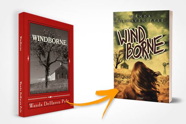
This is a very interesting example of a book cover re-design in the true sense of the word.
We can immediately see the problem: an undefined genre. This automatically implies an undefined target audience – one of the biggest mistakes in book cover design.
Something is missing here, too.
I added the female figure, our “heroine,” as the dominant figure. The book is about her and not a tree or a church, right? This undoubtedly turned this book into a story about a girl instead of a story about a small church on a prairie.
I also included a windmill, something that appears in the book, as a small symbolic element.
I’ve completely changed the tone and warmth of the cover to give it an old-fashioned look, which works because the story takes place through a few generations. I created the title lettering myself because I wanted the cover to have a handmade quality.
A more detailed overview of this book cover re-design example can be found here.
Book cover re-design 4 – Gold Boys
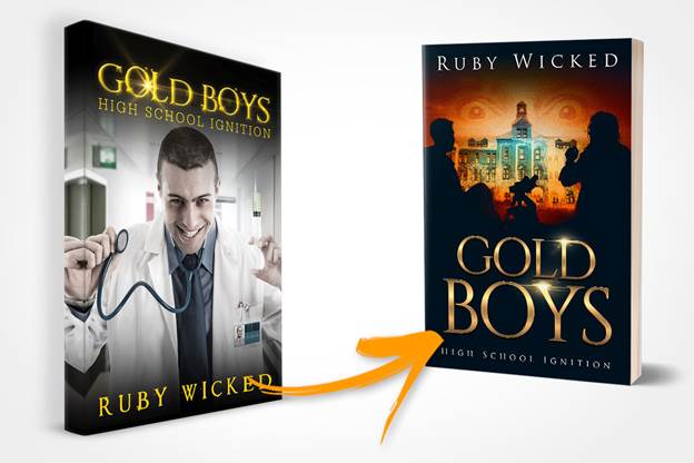
Can you tell from the original cover what this book is about?
The first cover so completely missed what it’s supposed to represent that it’s hard to understand how it could have happened.
We can very freely conclude that this is dark humor or a medical mystery and not the psychological thriller that it is.
The book is about two best friends (do you see them on the original cover?) who attended Saint Anselm College (do you see it somewhere?) together and are drawn into a dark detective story.
The original version is a great example of how a simple cover can mislead the intended audience and others.
A more detailed overview of this book cover re-design example can be found here.
Book cover re-design 5 – Worship of Hollow Gods
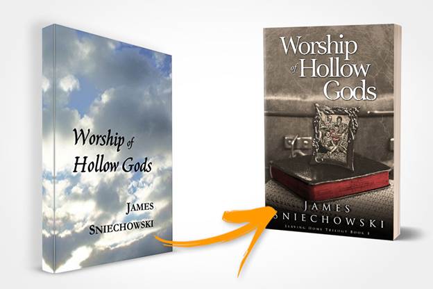
I’ve seen so many books where there’s a sky and some letters on the cover. Most people have no idea what it represents. We can only guess.
The title tells us what this book is about, but let’s be honest. Would you ever click on this thumbnail on Amazon?
If you’ve already put in the effort and time to write a book, then you can put in at least a minimum more to create a meaningful cover.
It doesn’t have to be a masterpiece designed by an expensive professional. Just give your book a chance!
A more detailed overview of this book cover re-design example can be found here.
Book cover re-design 6 – The Spirit War
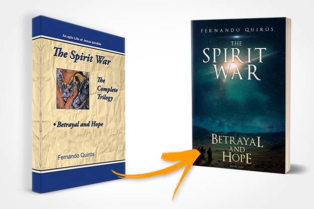
This is an interesting attempt to rely on one’s intuition . . . and a classic example of a cover design that’s all wrong.
First, I would like to point out that this is the first book in a trilogy that I had to re-design in its entirety. In the beginning, I had doubts about how to approach this because I knew that two more books were waiting for me, and all three, of course, must be recognized immediately as interconnected.
When it comes to topics like religion in a book, I am very careful because the authors very often present their personal vision of religion and faith. Great attention must be paid to every detail.
If you look at the complete re-design on the link below, you will see in the lower left corner the Christian three Kings coming to bring the “good news.” In the Christian religion, this is known as the news of hope.
A more detailed overview of this book cover re-design example can be found here.
Book cover re-design 7 – Onyx Webb
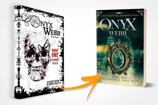
Lastly, a book cover design that screams “never do it alone if you don’t know how to do it.”
Never!
In her guest blog post on my site, “Never Judge a Book By Its Cover! – Are You Really Sure?,“ the author of this book describes the changes that cover re-designs brought to her publishing business and personal life.
As in the previous example, this book is the first in a multi-book series, and I was re-designing all of the covers.
The spider’s web visual element had to “stretch” throughout the whole series. It proved to be difficult to do because it interfered with my need to emphasize the main elements on each cover.
In the end, however, we went from what I consider to be a repulsive cover design to one that’s acceptable and interesting, and fits perfectly in the paranormal suspense and ghost fiction genre. That was our goal.
A more detailed overview of this book cover re-design example can be found here.
Is your cover ready for a new look?
Some authors have requested book cover re-designs of more than 10 books because they’ve discovered that a professional book cover design is a visual representation of your book’s quality content. It also shows your own appreciation for your hard work.
Yet, many authors worry that a re-design will cause brand recognition problems. Truth is, keeping a bad-looking cover is worse than reintroducing your work.
A good book cover design opens doors, so give your book a chance and watch your sales grow.
Who knows? Maybe there’s a masterpiece between your book’s covers that the world just hasn’t recognized yet.
Do you have questions for Alexander about cover design? Just ask them in a comment and he will reply.
Like what you’re reading? Get it delivered to your inbox every week by subscribing to the free Build Book Buzz newsletter. You’ll also get my free “Top 5 Free Book Promotion Resources” cheat sheet immediately!
This was such an interesting article and one that compelled me to consider my own book covers. I have a cozy suspense series that includes 7 novels and am writing the 8th. When I started writing, I suppose I never thought it would include so many books. As I am completing Book 8, I am wondering if re-designing the covers to easily portray the sequel components would be helpful. I have one cover I hate and several that I think could use modifications. Would you recommend similar fonts or styling across all the novels or something else? Is this something you would be willing to quote on and show me how a re-design could be of benefit?
Hi Faith,
I’m glad you liked the article.
If you hate one of your covers then it is a good sign that you should replace it. If this is a series of eight books, then you should definitely consider redesigning the entire series.
As for your question for fonts or styling – the whole series should definitely have a unique style and a recognizable font. When a reader sees any of your books, he or she should immediately recognize that they belong to your series.
There is nothing more important in book cover design than typography. Nothing is as important as font choice and its placement on the cover, If your typography is wrong, there is no point in having a great cover design with the best imagery.
Feel free to contact me on my email and I will gladly help you turn your covers into attractive “sales magnets”. A Book cover is powerful if not the biggest book marketing tool that undoubtedly strongly influences the sales of your books.
After my redesign, some book sales have jumped from a couple of copies sold per week to over a hundred sold per week!
In these cases, of course, the book cover design was not the whole reason. The redesign was one part of a renewed marketing push.
Book cover redesign is a great opportunity to restart the marketing and promotion of your book!
Alexander
I had a problem with all the re-designed covers. Most of them were better than the originals but all of them looked like they were mass-produced from the same machine, the colors, the composition, nothing truly original. I wasn’t impressed.
My last collection of poems was published by Presa Press in Michigan. I hated the design; the gorgeous painting I’d chosen was reduced to a postage stamp, the lettering off center and an ugly black. I bought back the rights and re-designed the entire book. I suspect if I’d asked a “pro” to design the new cover, it would have looked just like all the other covers of former best-sellers languishing on the shelves of used book stores.
It’s one thing to talk about cover design but to see all these examples shows the power of poor covers to great ones. A book will not sell with a poor cover period. Trust me, I am the co-author in the final example so I know all too well.
I agree! Thanks!
Sandy
This is a great article because it actually SHOWS us the difference in old and new in addition to speaking to the elements that were changed. Very helpful. Thank you.
Sallianne
I liked seeing the before and afters, too, Sallianne. I think they help a lot.
Sandy
I’m so glad you found it helpful, Sallieanne! I thought the before and afters really helped, too.
Sandy
This is just a comment. Alexander is very talented and has a good feel what might draw the readers’ eyes. Unfortunately, his price – $345 is prohibitive for most indie writers. I mean more than 95% of indie writers don’t make more than $2,000 per YEAR from their writing. To spend nearly a quarter of it on one cover is…well, unrealistic. The indie writer wouldn’t be able to stay in the game if he or she spent that kind of money on a cover. Up to $100 – and even that is too much. I’ve kept my cover designer from the trad-publisher when I went indie. Never more than $65 per cover. Trad-publishers pay their cover designers even less than that per cover. But, like I said, he does wonderful art covers. Good luck in his endeavors.
Thanks for the feedback, Edita! It’s helpful. I suspect that traditional publishers can get away with that rate in exchange for volume work. Indie authors can’t offer a steady stream of work.
Sandy
I’m interested to know who your cover designer is, Edita. Can you share?
The before-and-after here is ver y helpful. It would also be helpful to understand the costs involved with re-designs like this. What did these authors pay to have their covers redone, for one or a series of books? I’m sure it’s possible to give a range.
Thanks, Valerie. Alexander has a link to more images at the end of each re-design description; there’s a per-cover fee on each of those pages. He might offer a per-cover discount on a series; his email address is on the “hire me!” page on his site if you’d like to ask him.
Sandy
Sandra, don’t know how you always time your article to notch up what I’m working on, but…..!
Those before and after covers images are super-helpful to me now as my graphic designer and I create a children’s book cover. Her expertise is not specifically on covers, but she knows her craft, and now I have a better idea of what to suggest for a great cover. Thanks!
We’ve been in sync more than once, haven’t we? I hope you get the cover of your dreams!
Sandy
Excellent article. I’m a visual person so seeing the before and after made it hit home. In these examples, I can see they needed change, but how do you look at your own cover and say, “Yep, this one’s not so great?” Especially, if your book is in a genre that’s not so well defined.
Bree, a few of the ideas in this article might give you some ideas on how to determine whether the cover you have is the one you need:
https://buildbookbuzz.com/make-a-book-cover-decision/
Sandy
Do you also do cover designs? Or just redesigns?
Cover designs are Alexander’s primary business, Mobster. Learn more here: https://nessgraphica.com/book-cover-designer-for-hire/
Sandy
Thanka
Thanka
I’m finishing up my first book, 100 pages, called Kingdom Benefits, Benefits to Walking with Christ. I was going to use a sky photo, then noticed your example. I am on a limited budget. What is your price for creating a book cover? I will have an ebook too.
Diane, I believe Alexander has prices on his website. If not, on the site, he offers a way to contact him. There’s a link to his site in his bio above.
Sandy
Thanks for an excellent article 🙂 As a book designer, sometimes the visual idea is the hardest element to clinch. Next, is finding an economical image… it can take many hours searching websites—royalty free and /or free sites—for the right photo (or illustration). Remember to compare your covers with other covers in your genre and make sure the design and typefaces fits within that category.
Thanks for the great article Sandra! As usual you provide truly useful content. With regard to book covers I have a rather unusual situation: I do design them myself, and apart from financial considerations this is mainly because the covers feature my own artwork, given that my books are all graphic novels or picture books that I illustrate myself. I am also proficient with design software. I think the covers work, but there two of my books in my series that somehow never get the same traction as the others, and I have always wondered whether this has something to do with the covers. I’d like to know what Alexander might recommend in a situation like this, where the author is also an illustrator. Using someone else’s artwork is not an option in this case, but there may be design work to do using the author’s artwork.
Thanks
What a great question, Alan. I just flagged this for Alex to answer, but if others in the series have similar covers and are selling well, it might be the topic or description, right?
Sandy
Hi Alan, I’m delighted you enjoyed the article. It’s impressive that you’re both an author and illustrator for your graphic novels and picture books.
When some books in a series don’t perform as well, it’s good to consider the cover design:
Ensure a consistent style across your series. This helps in building brand recognition. Gather feedback on your covers, possibly from a diverse reader group. What’s clear to you might not resonate with the audience. A book cover designer can review your designs for improvements, focusing on layout, typography, and color scheme to enhance appeal.
Consider testing different cover designs online to see which attracts more attention.
Remember, the cover is a promise of the world inside your book. Sometimes, a minor tweak can significantly impact your book’s reception.
I liked nearly all of the redesigns, except ‘Career Game Plan”. The title text redesign was spot on. The ghosts wandering aimlessly over the race track lanes, in the wrong direction, not so much. The colours didn’t leap out at one, and it ended up looking dull, and uninspiring. It didn’t say ‘here is a whole new take on how to fix your career path’. Instead, it looked more like ‘here’s a few ideas I’ve taken from twenty other books and rehashed’. The redesigned covers of the other books though were great.
Thanks, Elaine! Your feedback is a reminder that there’s still a subjective element to this, right?
Sandy
Hi Elaine, thank you for your candid feedback on the ‘Career Game Plan’ cover redesign. It’s valuable to hear diverse opinions, especially when it comes to creative work like book cover design.
Your observations about the ghost elements and the color scheme are particularly insightful. The intention was to symbolize the confusion and lack of direction many feel in their career paths.
Regarding the colors, the aim was to choose a palette that’s professional yet approachable, but I understand your point about it appearing dull. The challenge with redesigns is striking the right balance between being eye-catching and accurately conveying the book’s essence.
I’m glad to hear that the other redesigned covers were well-received. Design is an iterative process, and comments like yours are incredibly helpful for continuous improvement. Thank you again for sharing your thoughts! 😉
Hi,
Some really good ideas here. Thank you for sharing them. Here is the cover for my upcoming novel Basic Instinct: https://poor.farm/wp-content/uploads/2024/01/BasicInstinctCover.png.
I was wondering if you have any advice on it.
Thanks again,
Ronan O’Driscoll
Hi Ronan, thank you for your reply.
The cover design for “BASIC Instinct” presents a striking visual, yet the choice of typography could be reconsidered. In professional book cover design, it’s a standard practice to limit the number of different fonts to two to maintain clarity and cohesion. Here, the title employs a font that, while aiming to reference the BASIC programming language, may not convey the necessary professionalism and could detract from the overall design.
The mix of typefaces on this cover could potentially confuse the messaging and genre of the book to the prospective reader. A more harmonious selection and pairing of fonts could enhance the visual impact and ensure the design complements the content effectively.
I hope I have helped you. 😉
That’s really helpful. Thank you Alexander