How to create book promotion quote graphics that help you sell
Affiliate Disclosure: This post contains affiliate links, which means if you click on them and make a purchase, I will receive a small commission (at no extra charge to you).
Book promotion quote graphics – also known as “image quotes” and “quote cards” – are social media images that excerpt praise about your book from:
- Book blurbs (testimonials and endorsements)
- Reader reviews (with permission)
- The book’s contents
You create these graphics to show that your book is respected by influencers and readers, or to give a small, intriguing sample of the book’s content.
Easy to create and share, they let you use other people’s words to say, “People like my book, so you will, too.” (Which is way classier than using your own words.)
What do book promotion quote graphics look like?
You can use a number of different approaches or treatments, but simple works best. Here are a couple of examples from major publishers for books you might recognize. (Click on the image to see the examples in a larger format.)
You’ll see that only one of these three includes the title. I pulled each from their book’s Amazon sales page, so in that situation, there’s no question about the book title.
I prefer to create them so that they stand alone anywhere, even without an explanatory post accompanying the image. To do that, you’ll want to include the title in the image.
A note about permissions
As you think about how you might duplicate what the big publishers are doing in those examples, keep in mind that Amazon requires authors to get permission from the reader to excerpt reader reviews on that platform. This is because the reviewer owns the review copyright.
To be safe, apply that permission policy to reader reviews from any other retail site or platform, too, including Goodreads.
By definition, you’re allowed to use anything from pre-publication testimonials and literary/trade/media reviews in quote cards and other book promotion materials.
How do you create them?
My favorite tool for creating social media images like these is Canva. I used it to create these promotional quote graphics for the Build Book Buzz Reader Book Review Forms. (Click on the image to see the examples in a larger format.)
Online tools that are similar to Canva include:
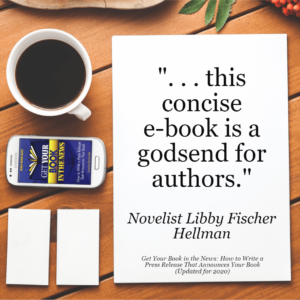
I gave the MockupShots image generator a try, too. MockupShots incorporates your book cover into hundreds of backgrounds, so with that tool, your book cover will always be in the image.
I’m not sure how I feel about including the book cover, though. What do you think of this one I created for my e-book with MockupShots?
Design tips
As you use any of these tools, work to keep it simple. Less is more (which is why I’m on the fence about the image that includes my book cover).
Be consistent with your quote images by using the same or similar templates for all book promotion quote graphics. For example, if you’re creating three for your newest book, all three should look similar for branding reasons.
Speaking of branding, be certain to incorporate book cover imagery and/or colors into your quote card.
To make sure your image has your cover colors, use the free Eye Dropper tool for color matching. Get instructions and a demo video in my article, “How to use Eye Dropper for consistent author branding colors.”
Using book promotion quote graphics
There are a number of ways you can use and share your quote cards. Here are just a few; I’m sure you can think of more.
- Share on social media with appropriate text and a purchase link in the accompanying post.
- Add to your author website.
- Distribute to your launch team to share with their networks
Don’t miss this easy opportunity to make the most of endorsements, reviews, and pithy gems from your book. You might even have fun with it!
What are other uses for book promotion quote graphics? How have you used them for your book?
Like what you’re reading? Get it delivered to your inbox every week by subscribing to the free Build Book Buzz newsletter. You’ll also get my free “Top 5 Free Book Promotion Resources” cheat sheet immediately!


Hi Sandra
Thank you for always providing great content. Can you explain how to apply a permission policy as quoted below?
“To be safe, apply that permission policy to reader reviews from any other retail site or platform, too, including Goodreads”.
Thank you
You’re welcome, Teri! It means track down the reviewer and ask for permission before using their review for promotional purposes.
Sandy
Hi, Sandra,
Thanks for all the amazing information you supply for folks new to book marketing like myself.
I use BookBrush for my quote cards. It has standardized sizes in the Custom Creator for social media. I like it because I can create graphics in a square or tall size for my newsletters, then use the same elements for Twitter posts or header (which won’t show up that well unless they’re horizontal). It just takes a few tweaks to change from one size to another. I also found it had a much shorter learning curve than Canva (which I never really did get the hang of).
A couple of questions: When I send out an ARC, I always tell the recipient that, in accepting the free book, they give permission for their review to be quoted for marketing purposes. Do you think that would cover me with Amazon? And how would I go about getting permission from an anonymous Amazon reviewer?
Thanks again!
I love that feedback on BookBrush, Gifford. Thanks. I looked at BB as one of the options I might use to create an example for this article, but decided that it was so much like MockupShots that it wouldn’t really add to the article. It can be hard to find a background with enough space to drop in the endorsement or review excerpt, so I’m glad it’s working for you. It’s easier to use than Canva for this because BB is designed for book marketing images, whereas Canva is an all-purpose, all-industry solution.
That’s a great question about review permissions, and yes, you’ve got that covered with your ARC statement. When Amazon reviewers don’t use their full or real name, you can still click on their reviewer name to go to their profile and see if you can glean any insights from that. When they want to be as anonymous as possible, which is often the case with haters (people you don’t want to follow up with anyway), they don’t reveal their “true” identity. Mine, on the other hand, uses my full name and my profile reveals my city and state. You can find me really, really quickly on Google with that little information.
Sandy
Hi Sandra,
Great info.
You were wondering about your mockup shot. For whatever my non-expert feedback is worth, if you can, I would get rid of the two blank cards – they seem pointless but my eye is drawn to their whiteness. You could turn the phone to vertical and maybe enlarge it so we see the cover image better. As you say, I think it’s worth including the cover to build recognition. I can often remember how a cover looks when I’ve forgotten the title.
I love your tips, Alison. Unfortunately, the MockupShots software doesn’t have that level of design power. You can do some editing — cropping, adding text (as I did), adding visual special effects, etc. — but you can’t enlarge or remove specific elements. And that’s OK. I think most of us want to grab an image that includes our cover and move along to our next book marketing task!
Sandy
Extremely helpful! Thank you so much for sharing your experience and expertise.
I’m so glad it was helpful, Janet! Thank you for the feedback. : )
Sandy